Project Overview:
Docodemo Art Global Branding Expansion
Client: Education through Arts
This project aimed to expand Docodemo Art's branding as the online art school goes international, offering art classes for kids worldwide. This involved creating an English version of the existing Japanese logo and designing and updating various digital assets to establish a cohesive and engaging online presence across multiple platforms.
Objectives:
-
English Version of the Docodemo Art Logo:
A new logo that retains the essence of the original Japanese version while being accessible to an international audience.
-
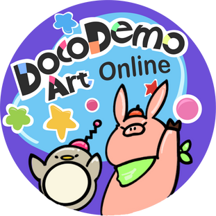
YouTube Profile Picture and Banner:
An engaging and visually appealing profile picture and banner for the Docodemo Art YouTube channel, showing the brand’s playful and creative spirit.
-
Facebook Banner:
A complementary banner for Facebook that aligns with the YouTube banner, ensuring consistent branding across social media platforms.
-
YouTube Intro Motion:
A dynamic and fun intro for YouTube videos featuring the Docodemo Art logo. The animation brings the logo to life, making it an exciting start to every video and reinforcing the brand identity.
The client wanted the branding and digital assets to communicate the joy and creativity that Docodemo Art offers to children around the world through its online art classes. The visuals are designed to be inviting, fun, and reflective of the educational value the brand provides.
This project successfully expanded Docodemo Art’s reach, establishing a consistent and engaging digital presence that resonates with both Japanese and international audiences.
The design process began with the creation of the English version of the Docodemo Art logo. A key focus was on designing the letter "D" to resonate with the playful and creative spirit of the brand. Each version of the "D" was crafted to reflect the unique characteristics of both the Japanese and English scripts while maintaining a harmonious connection between the two versions.

The final logo design was carefully aligned with the original Japanese logo, ensuring that the two versions felt cohesive and visually consistent, despite being in different languages. This approach allowed the logo to carry the same identity and message across Japanese and international audiences.
The profile picture was designed to be simple yet impactful, ensuring that it remained easily recognizable even at smaller sizes. The illustration was crafted to capture the essence of Docodemo Art—fun, creativity, and education. The design was kept clean and focused, with bold colors and clear lines, making it stand out on the YouTube platform and serve as an easily identifiable brand mark.
The banners for YouTube and Facebook were designed to create a visually engaging and cohesive online presence. The design elements were carefully chosen to reflect the brand’s playful and creative identity, with vibrant colors and dynamic compositions that invite viewers to explore the world of Docodemo Art. The banners were designed to work seamlessly across different platforms, ensuring consistent branding and visual appeal.
The intro motion for YouTube videos was developed to be engaging and lively, capturing the viewer’s attention from the beginning. The logo was animated to highlight its playful and creative nature and designed to be dynamic, with smooth transitions and fun movements that bring the logo to life. This approach reinforced the brand identity and set an exciting tone for the content that followed in each video.
You can view my showcased web graphics on DocodemoArtOnline


