top of page
Project Overview:
Branding or a series of
100% additive-free products
Client: Pure Nature
Objectives:
To create a cohesive brand identity for a series of 100% additive-free products. The objective was to develop a brand that resonates with the target audience's desire for purity, safety, and trustworthiness while communicating the product’s natural benefits across all touchpoints.
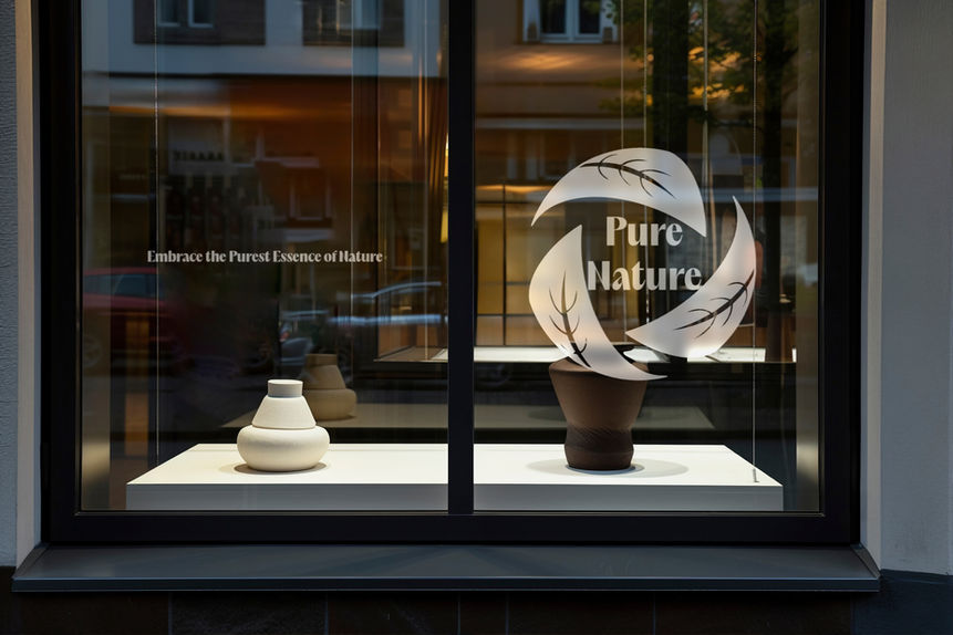
This project involved the complete development of a new brand for a series of 100% additive-free products. From creating the brand name and logo to defining the brand’s visual language and messaging, the focus was on building a trustworthy, transparent brand that appeals to health-conscious consumers. The final deliverables included a brand guideline, logo, stationery, and concepts for packaging that seamlessly integrated with the overall brand identity.


The goal was to create a design that would effectively convey the brand's essence and stand as a symbol. Initially, various arrangements were explored, including a leaf and a woman's profile. Still, it was realized that to achieve a visual that was in harmony with the brand's cosmetics line, it needed to be in harmony with the brand's product line.
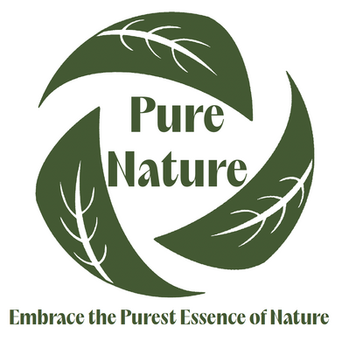
Ultimately, The decision was that the circular leaf logo of Pure Nature expresses the brand's commitment to natural and sustainable products. The circular arrangement of the leaf symbolizes unity, balance, and environmental cycles. The leaf's detail and organic form suggest growth, vitality, and connection to nature.
The color palette consists of earth tones such as greens, browns, and beiges to further emphasize the natural aspects of the product line. These colors also have a calming and soothing effect on consumers.
I chose Acma's type family for the brand font for a modern sans-serif font that evokes simplicity, purity, authenticity, and forward-thinking.
bottom of page


