top of page
Project Overview:
Bekr Vegan Products
Client: Bahram Health City Company (Bekr)
A forward-thinking company dedicated to creating high-quality vegan and plant-based dairy products. With a focus on sustainability and natural ingredients, BEKR aims to offer delicious, healthy alternatives to traditional dairy, making it easier for people to embrace a plant-based lifestyle without compromising on taste or nutrition.
Objectives:
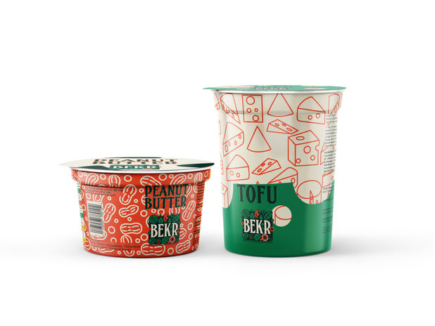
Create a distinctive packaging design that communicates BEKR’s commitment to high-quality, plant-based dairy products. The packaging will highlight the natural ingredients and emphasize the brand’s sustainability, health, and innovation values. The goal is to design visually appealing packaging that stands out on the shelves, appeals to vegans and health-conscious consumers, and reinforces BEKR’s position as a leading choice in the plant-based dairy market.


At first, I created an infographic based on the client's requirements. This included an overview of their history, produced products, shops, target audience objectives, advertising strategies, visual identity, and competitors. This helped me gain a clear understanding of the brand and provided a solid foundation for the design direction.

Zinnwaldite
#EBC3AE
Bush
#0B241C
Salem
#048C54
Xanadu
#EB4D25
For the color palette, I used a harmonious combination of natural hues. The warm, earthy tones convey a sense of comfort and organic feel, while the deep, grounding hues represent stability and a connection to nature. I used vibrant greens to symbolize freshness, growth, and sustainability—key elements of a plant-based product. The contrasting orange adds energy and vibrancy, creating a lively and dynamic essence. This contrast between green and orange brings a natural and inviting balance.


I chose FHA Condensed French NC for the logo because its bold and distinct style perfectly complements the product's natural yet strong identity. It gives the brand a modern yet timeless look, which aligns well with the values of sustainability and innovation. However, since this font can be challenging to read in smaller sizes or for extended text, I opted to use a different font—Kanit—for the stationery and detailed text. Kanit offers a more streamlined and readable option while maintaining the overall aesthetic harmony of the brand.
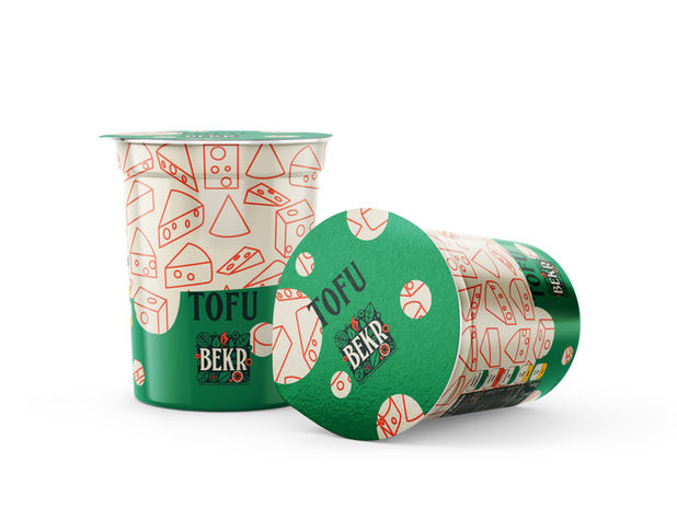
I created a unique and cohesive visual language for the packaging design using a pattern and outline of each product ingredient, all carefully integrated with the chosen color palette. This approach highlights the natural ingredients and adds a subtle, elegant touch that connects the products under a unified brand identity. The minimalistic style ensures the packaging is visually appealing and easy to identify, while the consistent use of colors ties everything together seamlessly.
bottom of page


